Duration | 1 week Roles | Research & UX/UI Team of 2
Design Challenge | Identify a small, local business that operates an e-commerce website and improve the user experience of the desktop site as a means to convert prospective clients.
Client | Precious Petcare is a mobile pet service provider based in San Diego, CA with a team of professional pet sitters who provide quality services for both dog and cat owners. Precious Petcare offers a multitude of dog care services including dog walking, dog boarding, doggy excursions, doggy daycare, and cat sitting.
Goal | The stakeholder would like the business's website to draw in more business, both from prospective and returning customers.
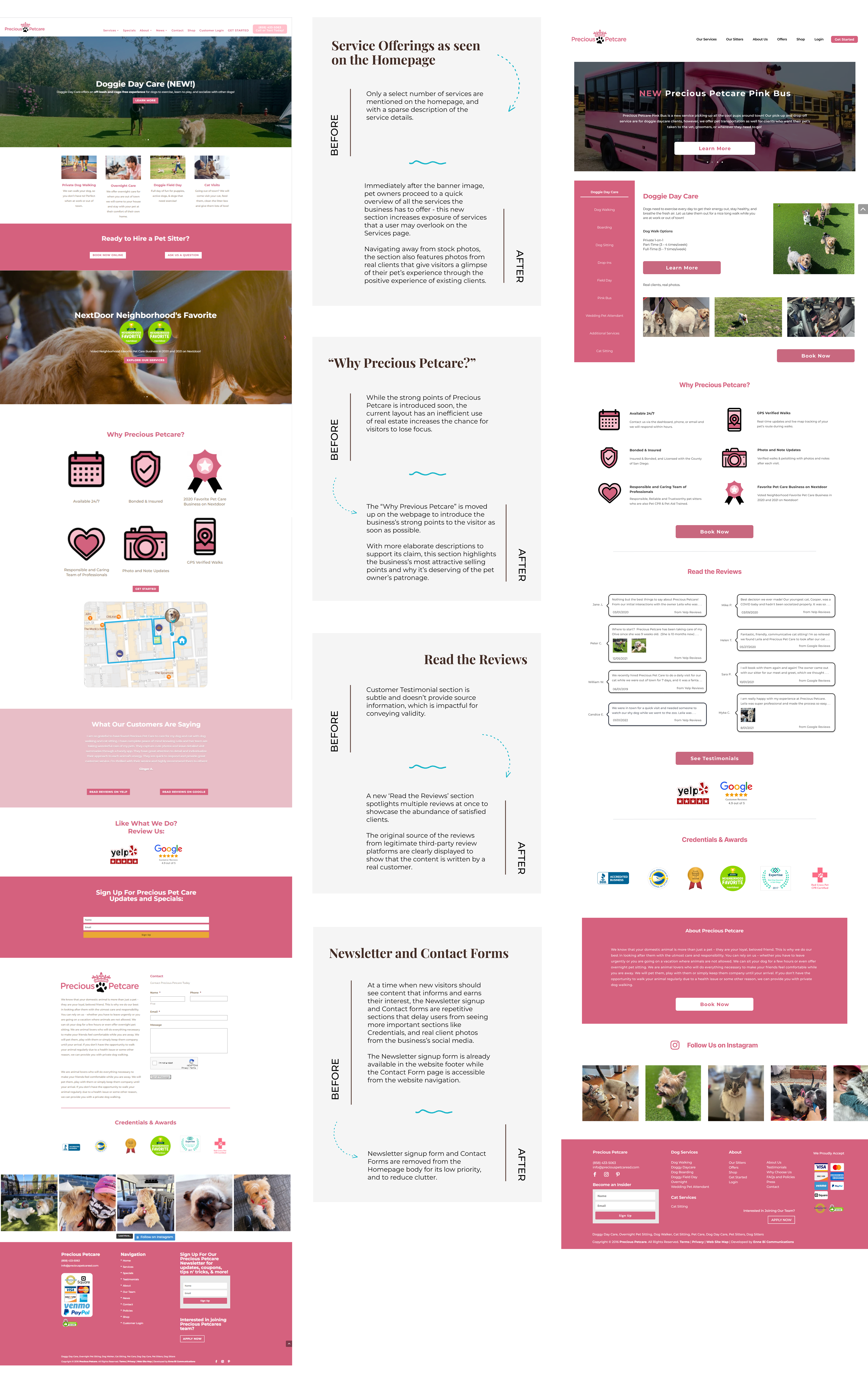
It all starts with Research.
Meet the Stakeholder, the Market, and the Pet Owners.
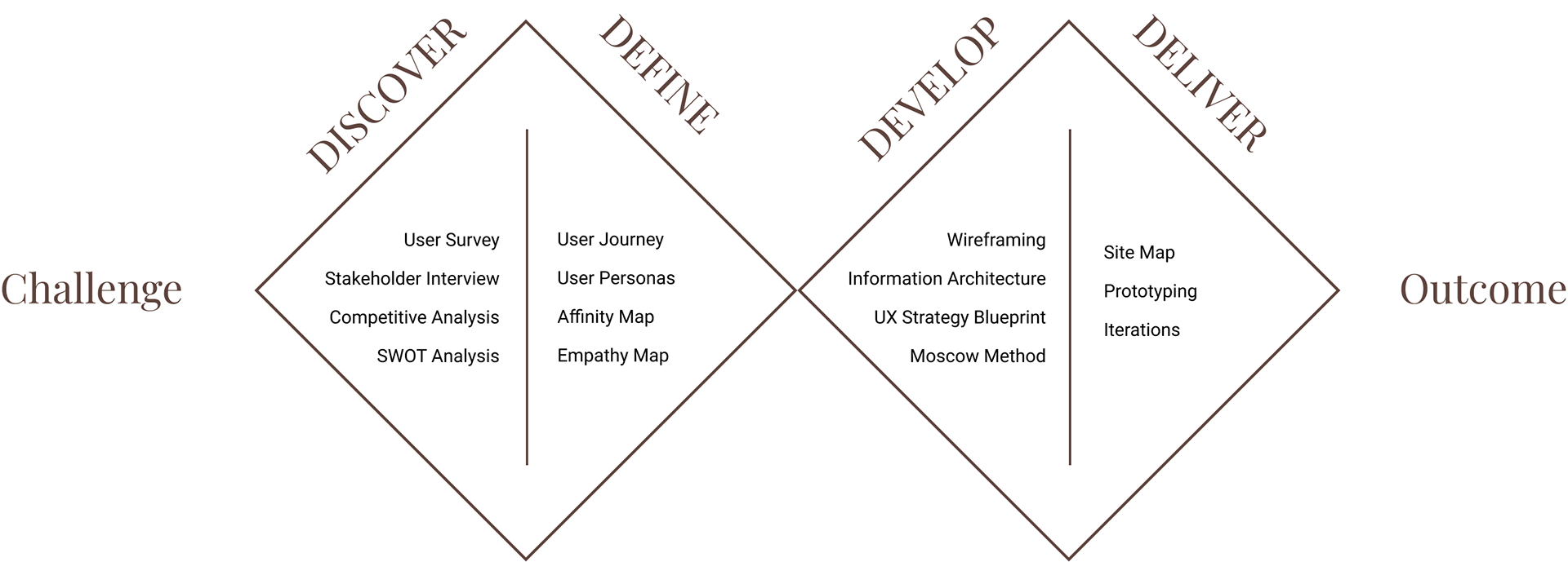
The first stage of our UX Research began with information gathering from various sources. In order to get a well-rounded understanding of the business and local market from different perspectives, we conducted a competitive analysis of the local competitors and a stakeholder interview to understand the stakeholder's needs.
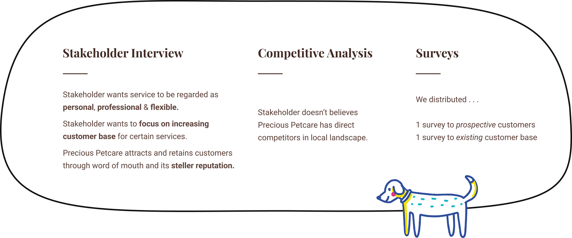
We also distributed two separate user surveys - one to prospective new clients and another to Precious Petcare’s clients.
Our first step in finding more about our users pertained to two questions: what do pet owners look for in a pet sitter, and what are the joys and pains of Precious Petcare’s existing clients?
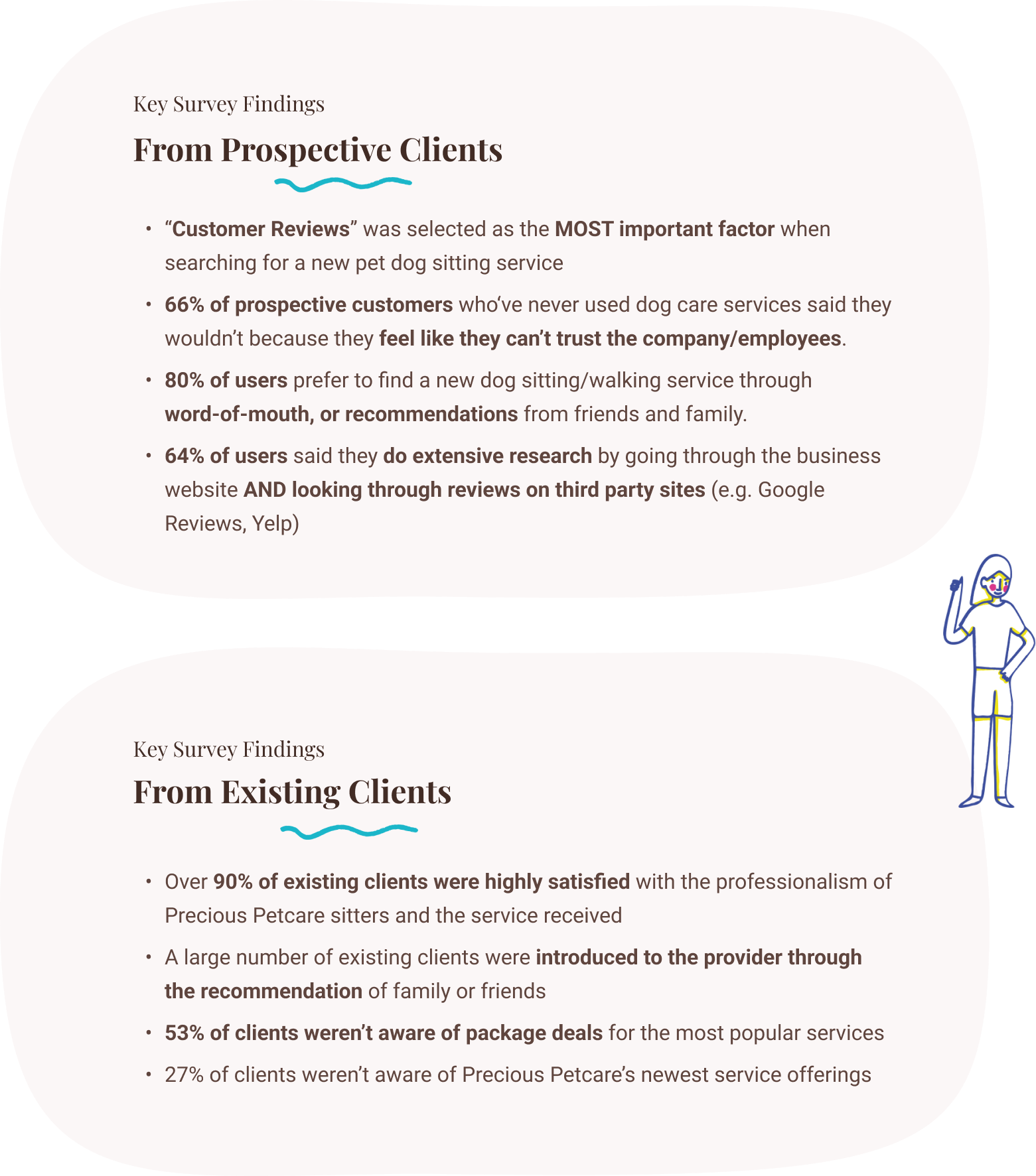
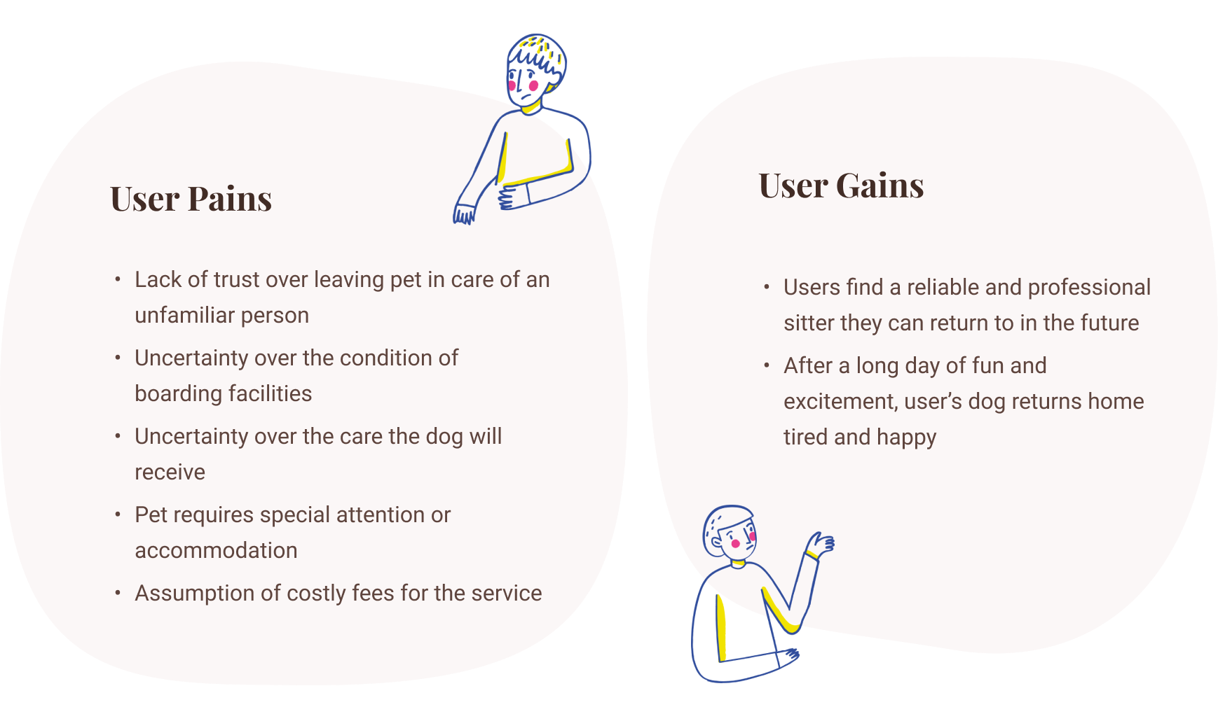
With the survey results, we moved on to affinity mapping and built our Empathy Map. There were some clear pains and frustrations from prospective clients hesitant to try a pet care service.

Click to Enlarge
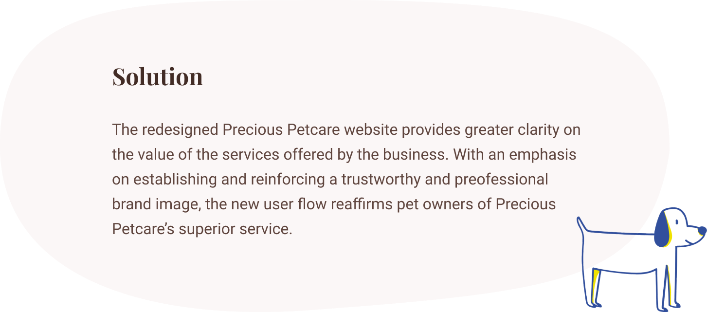
At this point, it was clear that we had a common theme among the user’s pains and gains. Overall, prospective clients need to be informed of the quality care their pets will receive, and to be assured their pets are always in good hands.
With our new site, our goal is to . . .
Increase new customer conversion by revamping Precious Petcare’s website to provide clarity on services, and to build a trustworthy and professional impression.
So then….
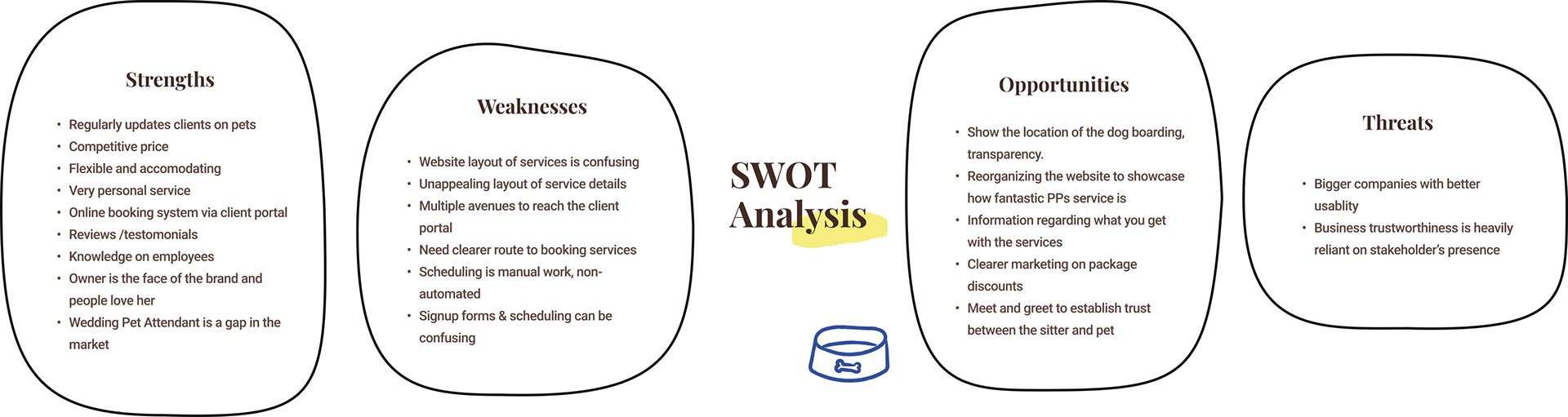
Comparing User Research against the SWOT Analysis
In the next step, we did a SWOT analysis of Precious Petcare using the insights from our user surveys and the stakeholder holder we’d conducted previously.
Click to Enlarge
As Precious Petcare doesn’t have a direct competitor in its service area, its biggest weaknesses are relevant to the usability and navigation of its current website and pose a minimal threat to the business.
From our client surveys, we also noticed that the stakeholder maintained a very strong relationship with her clients and we saw this situation as a double-edged sword; on one hand, the clients have a strong trust towards the quality of care provided by the stakeholder herself — on the other, this meant their retention may be contingent to the stakeholder’s individual presence.
Coming from the stakeholder’s interviews, it was apparent that Precious Petcare held many strong points that can’t be seen superficially from its website. The business was thriving with its existing clientele as the majority of the clients stated high satisfaction with the quality of care and service that the pet sitters at Precious Petcare were providing. Most clients had learned of the business by referral and became a returning customer after experiencing the professional service firsthand. Precious Petcare had a dedicated customer base and strong customer reviews to solidify the claim.
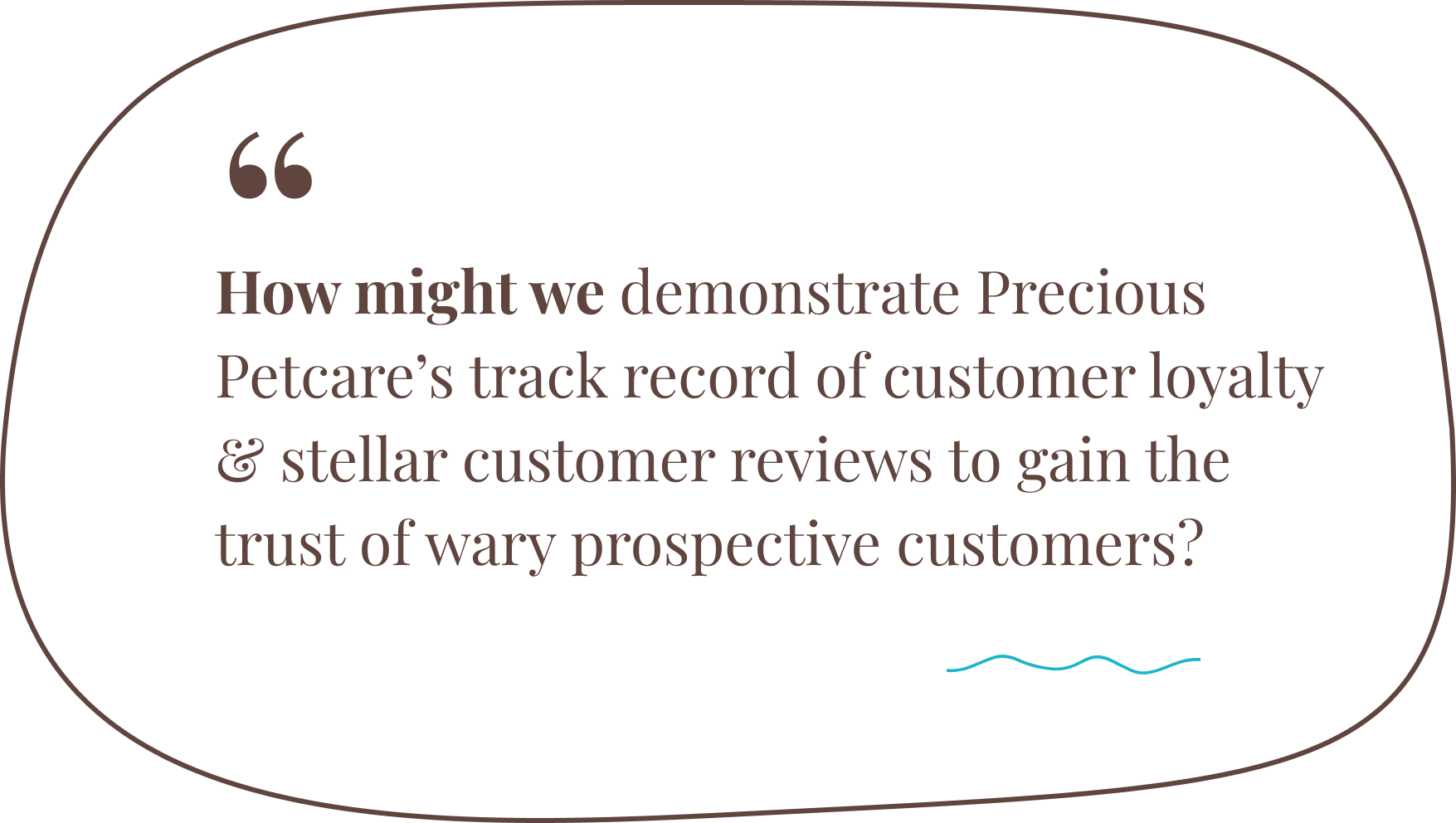
So . . . how does this tie into our user research?
If you recall the results of our user survey findings, prospective clients placed the highest priority on selecting a pet sitter who had excellent customer reviews. They wanted a professional pet sitter who was worthy of their trust and at the same time, prefer to select a new sitter from the recommendation of family and friends.
Wait, doesn’t this sound familiar?
Yes! All the aforementioned requirements are Precious Petcare’s strong points.
UX Strategy
Now that we’ve connected the dots and realize that Precious Petcare meets all the requirements, we needed to figure out how to convey this aspect to prospective clients arrive at Precious Petcare’s website for their first time. Our user survey respondents indicated that they tend to conduct extensive research on a business’s website and external reviews before making a decision on trying a new pet sitter. Thus, our goal is to restructure the site’s content and navigation in a way that fully informs new visitors of service expectations and gains their confidence to move ‘fur’ward.
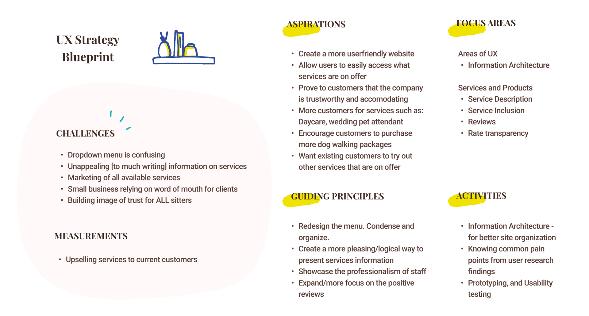
The key challenges that we’ll address in our UX strategy include:
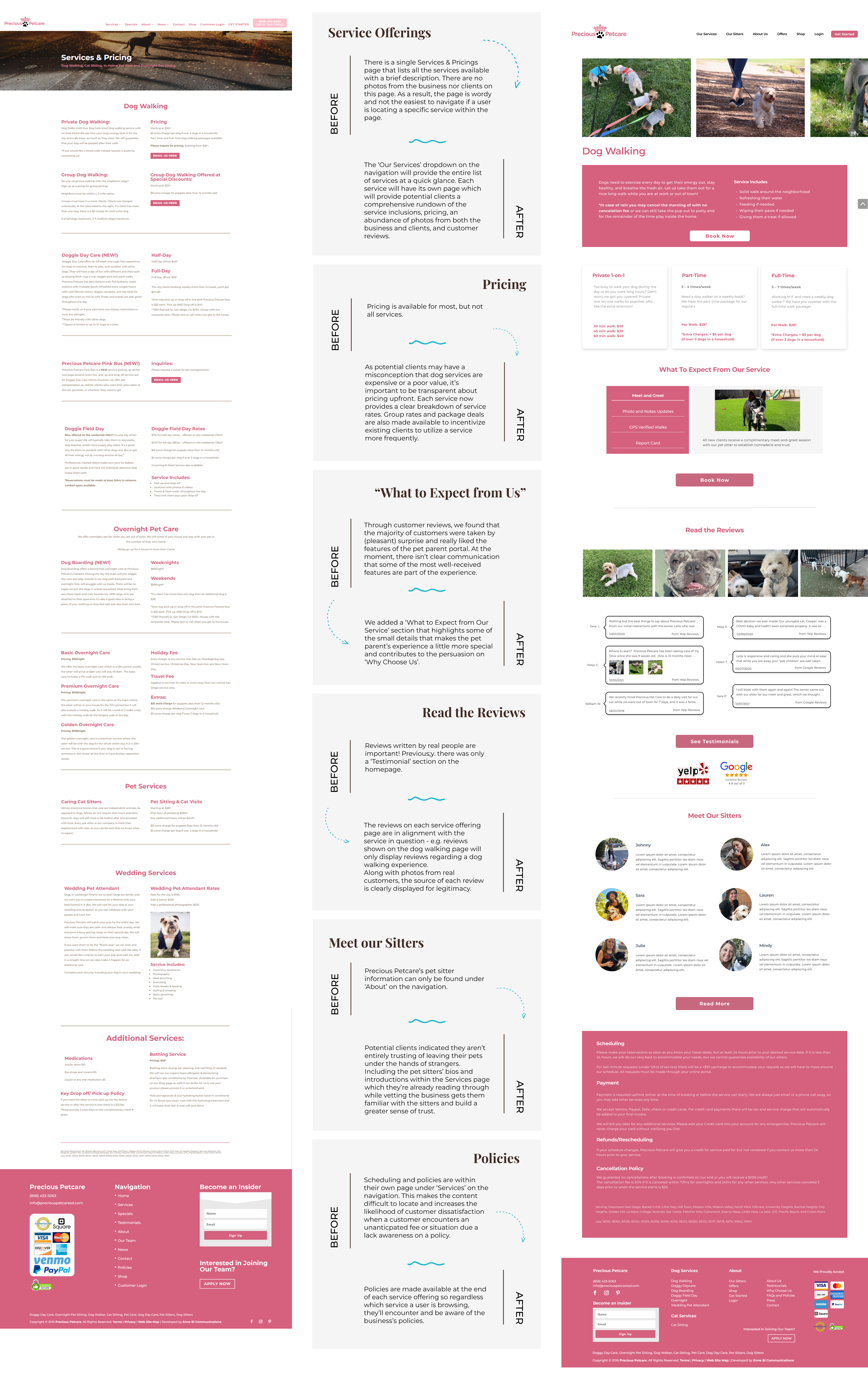
• Cleaning up the ‘Services’ page and elaborating service details
• Reinforcing business’s track record of excellent reviews
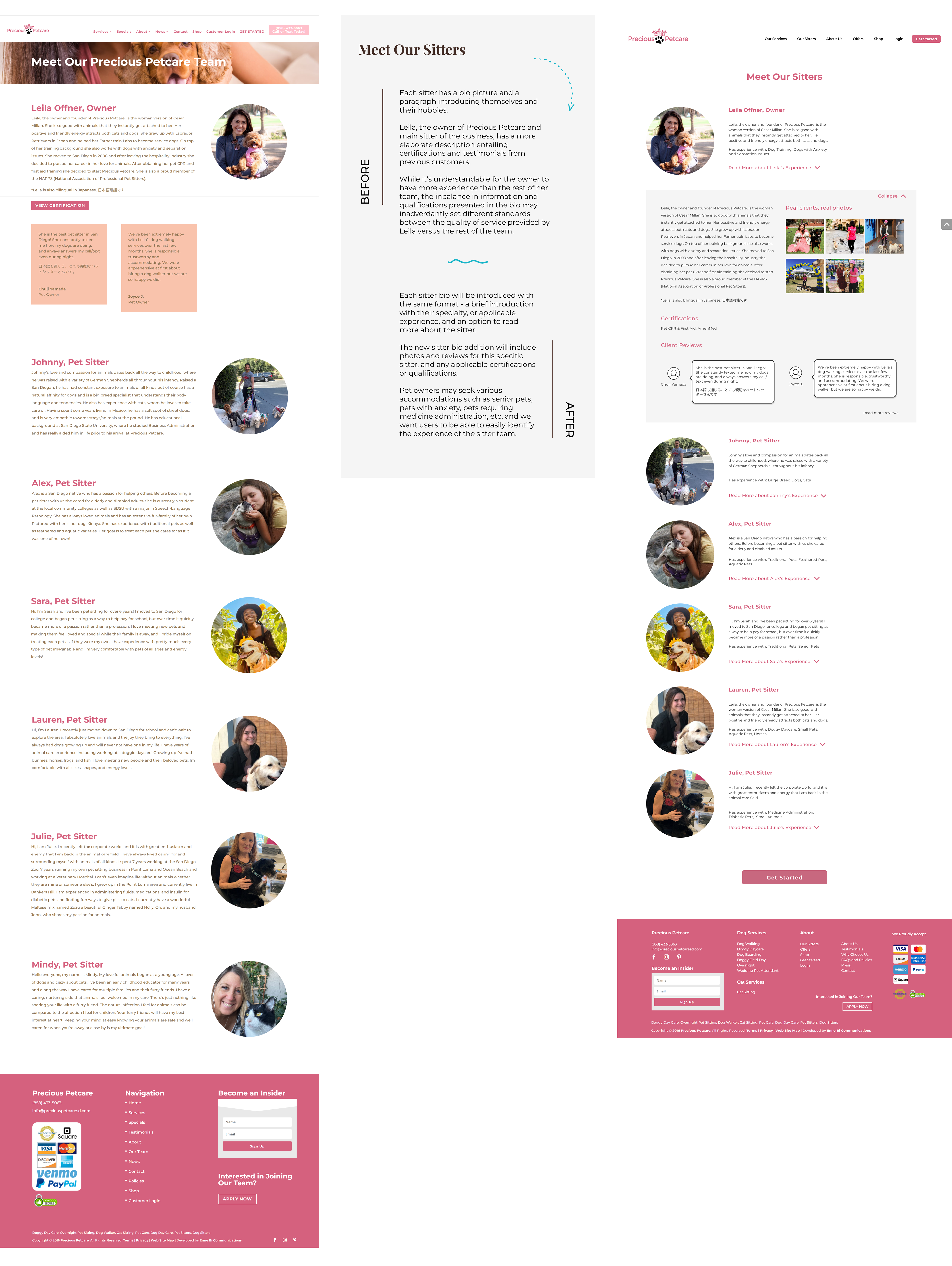
• Building trust for ALL sitters, as opposed to a heavy emphasis on one individual
By showcasing Precious Petcare’s stellar customer reviews and the professionalism of the team frequently throughout the site, we aspire to earn the confidence and trust of users.
Revamping the User Flow and Prototyping
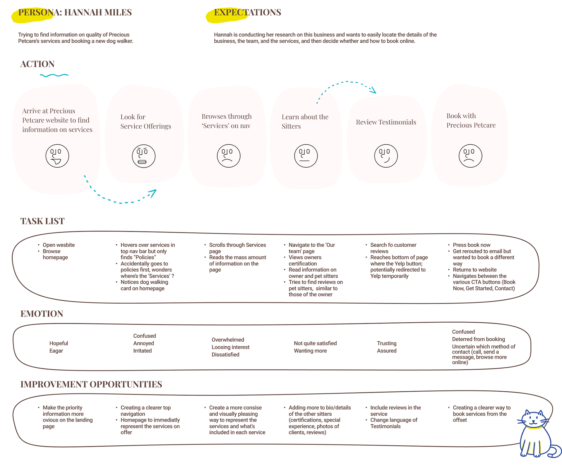
When we looked through the current website of Precious Petcare, we discovered a multitude of user flow blockages that would compromise a seamless experience.
In order to understand that, let's try walking in the shoes of a user navigating through the current website.

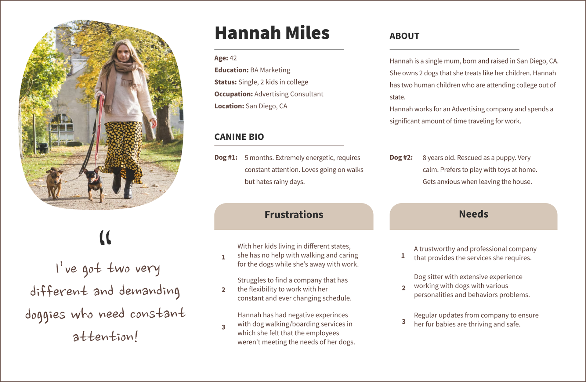
Click to Enlarge
Imagine that Hannah is in search of a new pet sitter in the local area. Hannah would discover Precious Petcare through an organic Google search and proceed to look through the information on Precious Petcare's website. Hannah's User Flow would play out as follows -
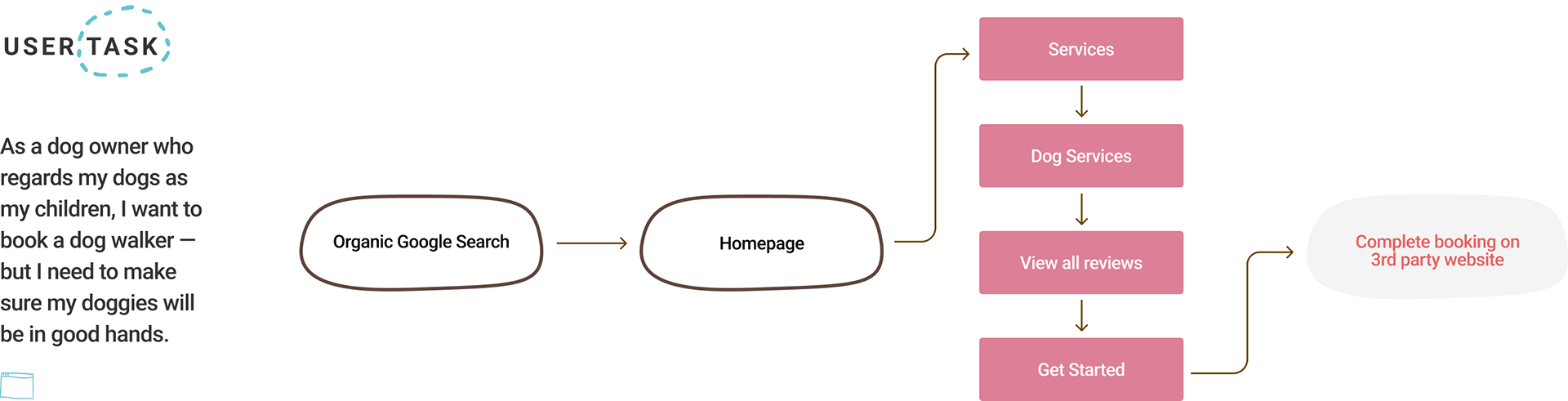
In a perfect world, Hannah should be able to locate all the desired information easily and be convinced of the business's trustworthiness to proceed as a new client. Unfortunately, we found a handful of pain points stemmed from the website's Information Architecture that would hinder a smooth user flow, thereby leading to a frustrating user journey that leaves the user craving for more information.
Click to Enlarge
Pain points of the current Information Architecture:
• The most important section, ‘Services’ detail page, was difficult to locate; it wasn’t an option under the ‘Services” dropdown and can only be accessed by clicking on the actual header button itself, or from relevant content on the homepage
• Current flow and content available fails to showcase the professionalism of the sitters, which leads to a lack of trust for new users
• Missing credible reviews/testimonials which are crucial to building trust
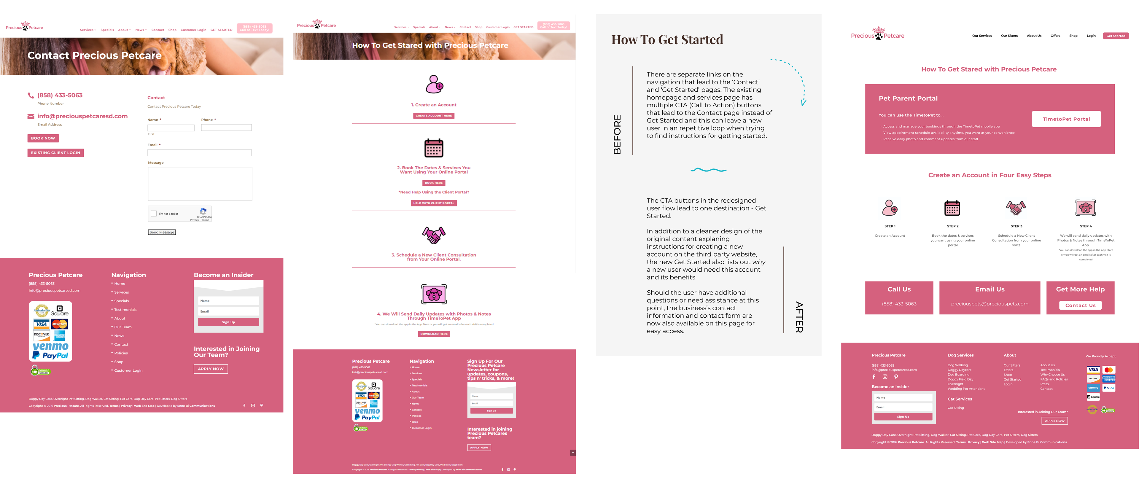
• Flow of CTA buttons are unorganized, and repetitive — CTA buttons throughout the site often directed user to the ‘Contact’ page which only provided a message intake form.
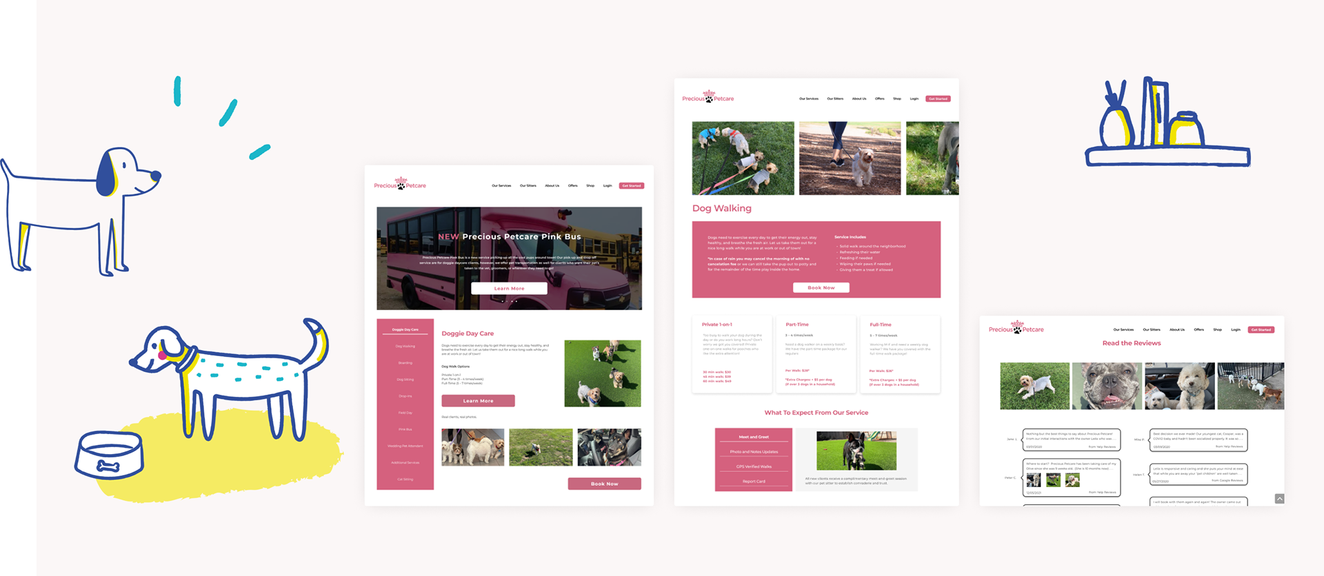
With the above pain points in mind, we gathered the content provided throughout the entirety of the website and reorganized the sitemap into one that enables the user to navigate and move through site information easily.
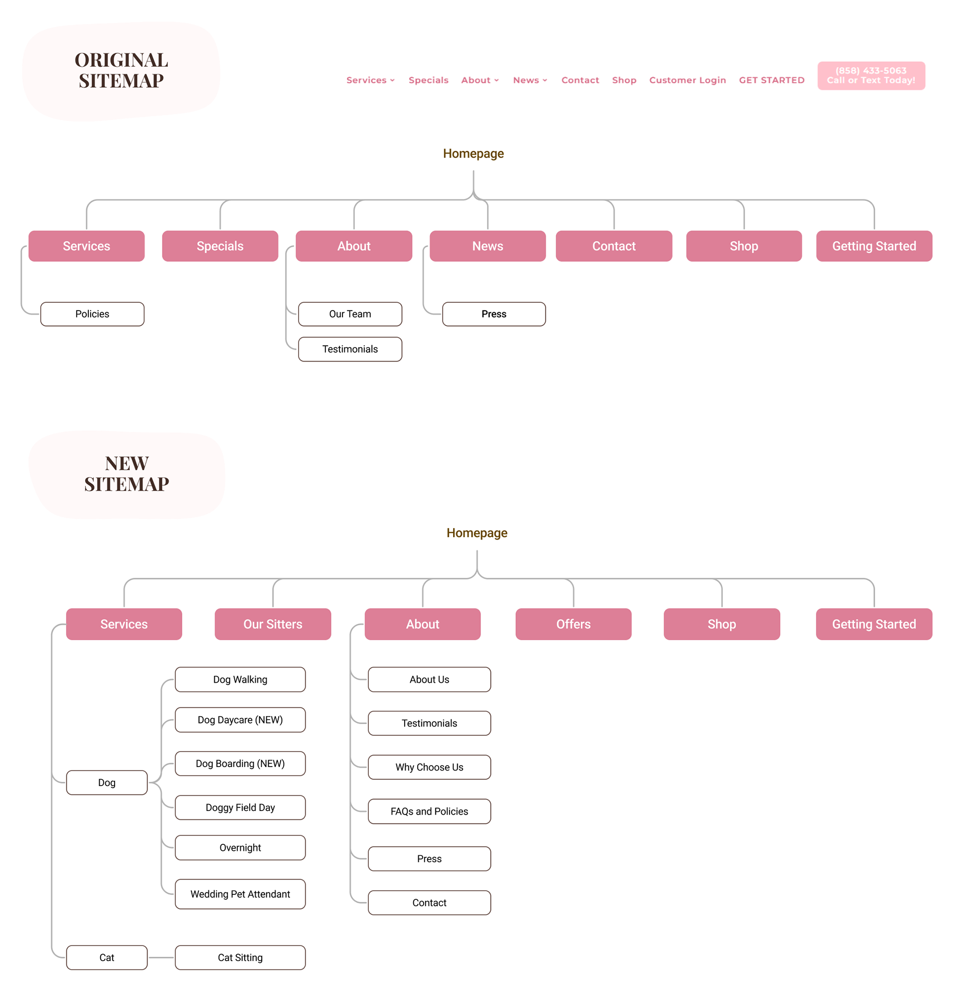
Click to Enlarge
With our revamped sitemap, the “Services” tab opens a dropdown menu that provides users an instant overview of all available services, and allows users to read more about the specific service they’re seeking. Immediately next to the “Services” page, we inserted the “Our Sitters” tab which was previously sitting under the “About” section. From our research, we understood the importance of new users meeting and learning about the sitters who will be handling their precious fur babies so we placed it towards the front with high visibility.
In the scenario where a new user begins on the site homepage in search of booking a new service, the ideal user flow would consist of the following steps:
From the homepage,
1. Navigate to the ‘Services’ tab
2. Select the desired service
3. Read through information detailed on the selected Service page
4. (optional) Browse through business reviews and pet sitter profiles
5. Proceed to book first appointment by navigating to the ‘Get Started’ button which currently redirects users to a third party site to complete the Sign Up process
With our user flow in mind, we were ready to brainstorm ideas for the redesign, and to put them down on paper. We used the Moscow Method to help us organize the essential website features and align our priorities for a Minimal Viable Product.

At the top of our priority list was first revamping the ‘Services’ page, and then the home page.
And then we brainstormed multiple variations of the homepage and services page in the form of lo-fi wireframes . . .
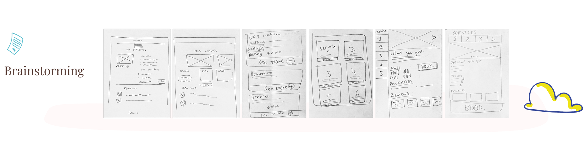
With our low-fi prototypes, we discussed among multiple variations and digitized our final selections into a mid-fi prototype.
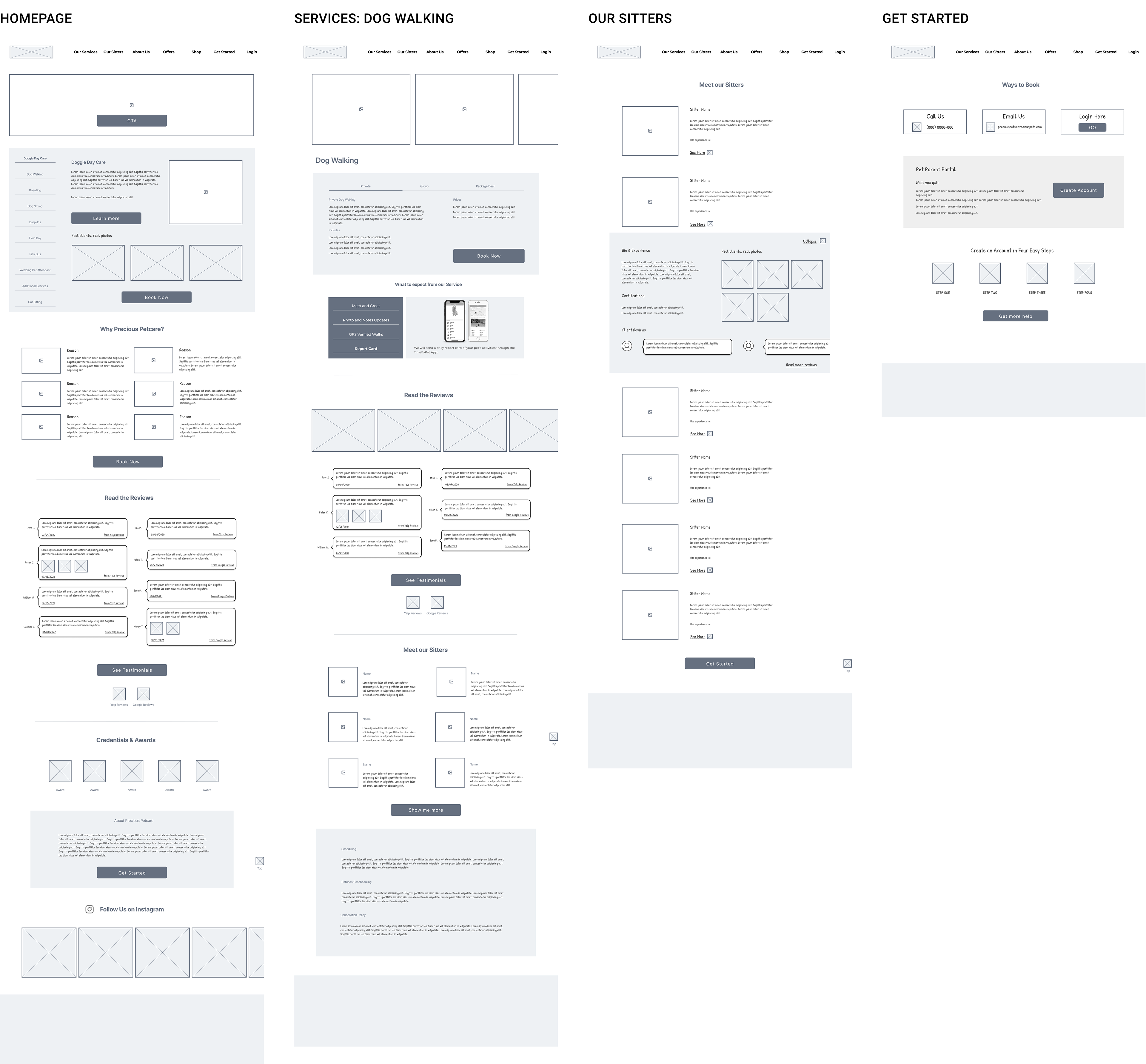
Click to Enlarge
Care to join us for a detailed tour and find out what's changed?
Continue onwards!